In 2009 I was working with Maisonneuve Magazine on a series of illustrations based short articles by the Canadian author and musician Dave Bidini. One of the stories talked about how his rock heroes had become more human to him. I was really interested in this idea so one of the sketches that I developed was based on the outrageous centerfold inside David Bowie's Aladdin Same album. I loved the original artwork, Bowie is far more than human, maybe from another planet, maybe from another dimension, maybe some sort of God. So my idea was to bring him back to Earth by taking this strained pose and turning it into him supporting his back while carrying his laundry basket.
The art director passed on the idea and the pencil sketch has hung in my studio for 7 years waiting for me to finish it. So with David Bowie's untimely death this past week I knew it was time to revisit the idea. So here is my loving and hopefully kind of funny tribute to one of the artist and musician
David Bowie.
Wednesday, January 20, 2016
Monday, September 14, 2015
From The Walls Of The Pacific Gas And Electric Company
Pacific Gas and Electric Co. commissioned me earlier this year to paint a series of poster style paintings to hang in their offices in San Francisco. These 24"x36" paintings feature portraits of the company's actual line workers and the technology that they use on a daily basis.
Monday, February 9, 2015
The Domestic Adventures Of Batman And Robin
Labels:
batman,
comics,
common law,
dc comics,
domestic,
funny,
home life,
love,
relationships,
robin
Tuesday, January 27, 2015
Bat-Man V Ben Affleck
March 2016 will be witness to the release of the Batman V Superman movie. The announcement of Ben Affleck to play Batman was met by a might groan from the fans and quite a lot of internet backlash. I don't know how those people feel today but from what I've seen so far I think Ben Affleck looks great as the Dark Knight. We'll see how it all turns out.
In the meantime enjoy my little tribute entitled "Hanging On The Weekend!"
www.johnperlock.com
Labels:
batman,
cartoon,
common law,
dc comics,
domestic,
funny,
home life,
love,
relationships,
robin
Monday, June 23, 2014
Case Cutlery 125th Anniversary Poster
In November of last year I was hired to create a sketches for a possible 125th Anniversary illustration for W.R. Case & Sons Cutlery. After five months of sketches the project was ended and the artwork will not be finished. So let's start here with some of the earliest sketches. The origanl art director requested an image of the knives being assembled or something to stress the long history or knives that have been "Made In The USA".
The original art director was taken off the project at this point and we started over with an image of the history of the company. They wanted everything from the company's history included in this piece including the office secretaries, one of the owners Maple tree farm and the collector club. I couldn't see the appeal of these images to the collector of these knives. If I'm a collector of knives I don't want a picture of other knife collectors, I want to be blown away by the company and the product. So I talked them into this image showcasing the very earliest Case wagon, their involvement in creating knives for WWI,WWII and the Apollo mission, the commemoration of Haley's Comet, as well as their history creating razors and hunting knives. We got close but in the end the artwork was never taken past this point. I'm working on finishing it up in my spare time so watch out in my portfolio for a final product one day.
All Sketches are © John Perlock 2014
The original art director was taken off the project at this point and we started over with an image of the history of the company. They wanted everything from the company's history included in this piece including the office secretaries, one of the owners Maple tree farm and the collector club. I couldn't see the appeal of these images to the collector of these knives. If I'm a collector of knives I don't want a picture of other knife collectors, I want to be blown away by the company and the product. So I talked them into this image showcasing the very earliest Case wagon, their involvement in creating knives for WWI,WWII and the Apollo mission, the commemoration of Haley's Comet, as well as their history creating razors and hunting knives. We got close but in the end the artwork was never taken past this point. I'm working on finishing it up in my spare time so watch out in my portfolio for a final product one day.All Sketches are © John Perlock 2014
Wednesday, June 12, 2013
The Roller Derby Variations
Unused Roller Derby logos have piled up on my computer! They may end up as T-shirts but I'd rather find them a better home.
So, if you're a start up Roller Derby league or maybe you're an established league looking for a change please contact me. I have a lot of designs that with just some tweaking and maybe color changes, could be put to good use.
© John Perlock 2013
So, if you're a start up Roller Derby league or maybe you're an established league looking for a change please contact me. I have a lot of designs that with just some tweaking and maybe color changes, could be put to good use.
© John Perlock 2013
Thursday, November 15, 2012
It's A Mad Men Munster Party
I know everyone loves the TV show Mad Men and I don't mind it, I've seen a few seasons. But, many of the characters bug me and I'm often annoyed by Don Draper. He seems like a bit of a dope, sorry. His goof ball expressions and 5 o'clock shadow make me think of Herman Munster. Again, I'm sorry.
So I figured why not illustrate those 1960s ad men as characters from The Munsters? Besides, many of you have been invited to a Mad Men costume party or considered it for Halloween so it seems to make sense that they would have considered dressing up as The Munsters in the 1960s.
Monday, September 17, 2012
Derby Art On A Derby Girl
This weekend will be the Championship bout for the Toronto Roller Girls. Back in July I began work on these posters. ToRD had the Chicks Ahoy lined up for the championship game but it would be another month before we knew who would be taking them on. So how do we put a poster together with only one team? My answer was this heavily tattooed roller girl getting a chest piece done for the final match of the season. That way I could do a half finished tattoo that could be changed for the second version when we found out that the Gore Gore Roller Girls would be taking them on. I've also included the under painting for the artwork so you can see a little bit of how this image was constructed.
Thursday, August 2, 2012
Knee-Deep In Doubt
This was painted for Orange Coast Magazine in California. As the tides of the American West Coast rise the cottage Island of Balboa is in danger of being swallowed up by the ocean. I was asked to paint a version of Grant Wood's "American Gothic" this time featuring wealthy Californians hip deep in the rising waters.
Above is my first sketch for the project. I still prefer the man in this sketch but it was decided that he was a little too young and far too East Coast.
Here is the final magazine layout where the art director has applied water damage to the magazine spread. This was a surprise to me but I think it worked out with the story.
Above is my first sketch for the project. I still prefer the man in this sketch but it was decided that he was a little too young and far too East Coast.
Here is the final magazine layout where the art director has applied water damage to the magazine spread. This was a surprise to me but I think it worked out with the story.
Thursday, May 31, 2012
"Care Bears Ink" T-Shirts & Hoodies by John Perlock | RedBubble
"Care Bears Ink" T-Shirts & Hoodies by John Perlock | RedBubble:
My somewhat infamous illustration of the Care Bears' Gumpy Bear receiving his stomach tattoo is now available as a shirt from the folks at Redbubble.com. I'm happy to say the designs are printed in the United States on American Apparel clothing and are made to order so you can be certain that there will be relatively few of them ever made.
Thursday, May 24, 2012
More Art Of The Roller Derby
I just posted a collection of Roller Derby designs from this year and I ended it with a tease of the upcoming "Roller Boogie" assignment sitting on my desk. Well I thought I had a month or so to just play with the disco theme when in reality it needed to be done in a couple days. So this poster isn't anything like what I had stewing in my brain but it was fun none the less. I got to keep my "Solid Gold Hits" and some disco lens flares. Enjoy.
Tuesday, May 15, 2012
The Art Of The Roller Derby
http://www.redbubble.com/people/johnperlock/portfolio/
This year I've got three new Roller Girls pieces under my belt already and a few more scheduled. The first piece this year was my recruitment poster. This poster was based on the WWI recruitment posters but took on a YWCA look in the end.
The next one was for the Junior fans of the roller derby. I abandoned the traditional look of the Tri-City roller girls and went straight for a Saturday Morning Cartoon vibe. It was lots of fun and hopefully the shirts will be on the merch table next bout.
Speaking of the next bout, Death Race 2012 is this Saturday night and I did a tribute the 1970s and 1980s drive in movie posters, a little tacky and deliberately low-fi but it was just what I wanted. If there are any Roller Girls in need of a poster or shirt please be
sure to call me up. So what's next?Roller Boogie!
Monday, February 27, 2012
GOP In A Fighting Mood

This weeks The City Paper from Nashville features one of my illustrations on the cover. The fine folks at The City Paper called me up looking for a boxing republican elephant for their cover story about the Republican Primaries in Tennessee. I did some sketches of a victorious elephant and this mean one with his dukes up. I'm glad this is the one they chose. Tennessee might be a red state but it looks like they've going to have their work cut out for them in the coming months.
Labels:
art,
commercial,
cover,
elephant,
illustration,
john,
perlock,
political,
politics,
primaries,
republican
Wednesday, January 11, 2012
Society Of Illustrators Opening Reception
This year marks the first time one of my paintings has been included in the Society of Illustrators prestigious annual exhibition. Having never been to New York City it was the perfect reason to go for the first time. My wife an I made it to the opening reception on January 6th and had a great time. The work included in the show was exceptional and I was proud to be included in the group. Here are a few photos from that night including the first original painting I've ever seen by J.C. Leyendecker and the amazing Norman Rockwell piece over the bar.
The show runs for most of January so be sure to see it if you're in New York.


Labels:
art,
artwork,
commercial art,
exhibit,
illustration,
illustrator,
john perlock,
perlock,
reception,
show,
society of illustrators
Tuesday, November 15, 2011
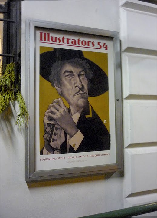
Society Of Illustrators 54

For the first time my work has been accepted by the legendary Society Of Illustrators. Ever since art school I've wanted to be a member of the society and be included in the annual. A few hours ago I got the call that my tribute to George Romero and J.C. Leyendecker made the cut. I'm very excited. With any luck I'll be able to make it to the show's opening.
Wednesday, October 5, 2011
Care Bears' Ink

The little know secret story behind the Care Bears' stomach artwork. This illustration has been hanging around the studio unfinished for months. I can't remember where the idea came from but I began the painting a few months ago before abandoning it. I decided last week to give it a second try and proceeded with a pen and ink drawing that was then colored digitally. This process felt like it gave the Care Bears a much more authentic feel not that this was an attempt to copy their look exactly. I guess it's just a tribute.
Labels:
bear,
care,
cartoon,
cartooning,
digital,
editorial,
humour,
illustration,
illustrator,
ink,
john,
pen and ink,
perlock,
satire,
tattoo
Thursday, September 15, 2011
Drag Strip Courage And Compacts
Monday I asked the Toronto Roller Girls if they needed any poster art for October. Turned out they needed a poster for Wednesday so I got my act together and "whipped" this poster together on Tuesday. I though I would show the contrast of the tough side of the derby girls with the dainty which I think really works here. It cracks me up when you go see the derby and they're dancing while waiting for the whistle to blow. Maybe Roller Disco will be the next big thing for those of you on eight wheels. If anyone needs a roller disco poster done please call me.
Labels:
art,
commercial,
derby,
girls,
hamilton,
illustration,
illustrator,
john,
perlock,
poster,
roller,
toronto
Tuesday, September 6, 2011
Roller Derby - Double Header
I've teamed up with Kitchener's Tri-City Roller Girls for this loving tribute to the Sweet Valley High book series. This poster is for the Sept 24 match featuring the Tri City teams the Vicious Dishes and the Total Knock-Outs verses Toronto's D-Vas and Montreal Les Contrabanditas. I'm not sure where the Sweet Valley High idea originated but once I had it in my head it was obvious that it needed to be done.
Labels:
d-vas,
derby,
girls,
illustration,
john,
kitchener,
les contrabanditas,
montreal,
perlock,
roller,
tord,
toronto,
total knock-outs,
tri-city,
vicious dishes,
waterloo
Friday, August 5, 2011
Mid-Century Modern Cartooning
Here's another brand new illustration sample. I'm still exploring the world of Modern cartooning, pen and ink drawings with digital color. I'm not giving up the painting but this is a fun break so I hope some of you art directors can find a use for it. I'd love to do some more!
Labels:
1950s,
1960s,
animal,
book,
cartoon,
cartooning,
children,
childrens,
comic,
illustration,
illustrator,
john,
kids,
mid century,
modern,
perlock,
retro,
vintage
Wednesday, July 27, 2011
New Media = New Illustrations
I grew up on Chuck Jones cartoons and spent a lot of time drawing my own comics when I was a kid. It feels like it's time to dust off the old crow quills, brushes and ink bottles to see what I can do with them. The end result has been these ink drawings that have been digitally colored, 20th Century cartooning meets 21st Century Vector graphics.
Labels:
art,
artist,
cartoon,
commercial,
digital,
illustration,
illustrator,
ink,
john,
pen and ink,
perlock
Subscribe to:
Posts (Atom)